Yes, that’s another TED@NYC picture as the “featured image,” but don’t run away! It’s a post about science, I swear!
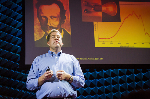
The photo up above is from the Flickr set (which, by the way, has been edited significantly since yesterday…), and I like it a good deal. Mostly because, as the joking caption suggests, that photo of Max Planck looming over my head has a kind of serial killer vibe to it. But here’s the thing: this is the original phtoo that’s on the slide:

It’s a black-and-white photo from 1901, and in my slides, it’s black and white. But in that photo, it’s got an interesting orangey-red cast to it. Which works really well in the context of the picture– it stands out nicely from the blue-lit back wall, and contrasts with my “gonna be on tv” light-blue shirt. It’d be a less effective photo if it were shown in true color.
My question, though, is how did the photographer get that effect? I don’t think it’s a PhotoShop thing, because nearly all the photos of speakers with slides behind them have the same thing going on, with the slides having an orange-y tint. On the other hand, it’s only nearly all of the photos, not absolutely all of them. So it’s got to be something that was done deliberately to get that effect in places where it’s appropriate to have it.
But while I applaud the artistic judgement, I don’t understand how they did it. It’s got to be some trick of lighting and focus. The shot is focused on me, with a smallish depth of field, and I’m lit by really bright lights placed near the front of the stage (that, happily for nervous speakers, partly obscured the crowd), so maybe it just looks reddish because of lower light levels (when I take shots of the kids in inadequate light, they tend to be a little reddish). But it seems a little too specific for that, and again, some other shots (like this one where you can see 1) the tiny stage, 2) the TED sign, and 3) my white sneakers…) have slides that are closer to their true color.
Anyway, I know just enough about photography to be dangerous, but I know there are people who read this with way more experience and knowledge than I have. So I figured I’d throw this out there for those folks: How did the photographer get that effect?
(Repeat of the image for those reading in RSS who don’t see the “featured image”:)

Proably a color temperature difference between of the light on you vs the white point of the projector.
The photo/video indusry calls this “white balance”.
It isn’t low lighting that causes a reddish tint to indoor pictures, it’s the color temperature of the light source. Standard incandescent light bulbs have a color temperature around 2800K (where sunlight is 4800K), so they look red. You normally don’t notice it because your eyes/brain automatically adjust your perceptions to the available light, but in a photo it stands out.
A camera flash is designed to mimic natural light. This picture doesn’t look light you are lit by a flash, though. If it isn’t digital trickery, then probably there is a spotlight on you that was specially designed to emit natural light, but the background lighting was just normal incandescents.
In the photos that do not show this, was the speaker (and thus the spotlight) nearer to the background image? In that case, the spotlight would wash out the background lighting, and the picture would look normal.
Another option: it isn’t clear from the picture if that is a projected image, or a printed one. If it is projected, then maybe the projector is malfunctioning.
Just spitballin’ here…
Of course it could easily be done in Photoshop or similar apps. But let’s assume arguendo that it happened in-camera. If that’s the case, I would definitely bet it’s a happy accident rather than something the photographer planned for — though she might well embrace and emphasize the effect.
It could be a white-balance thing. If the lights on you have a cooler color profile than lights reflecting off the screen, then you’d balance for the foreground lights and the background would shift to the red. That’s a huge color shift though, and I don’t know of any lights that would have that big of a shift. Plus, the lights on the background pyramids are very blue. So I’m not betting on just white balance tricks.
I’m more suspicious of a color shift from the projection screen. I know many screens have reflective elements built in to give brighter reflections. I could believe that these create a color shift at shallow angles. It’s also interesting that there’s a color shift across the screen, which seems to have an angular component (less color shift with a more direct view angle). I’ll google a bit and see if there’s anything I can find about that.
If its an lcd projector, then the light from the projector should be polarized. I’m pretty sure that at least some projector screens must preserve polarization since this is how 3D movies work now (isn’t it?). If that’s the case, then the only light in the field of view here that would be polarized is the light from the projector screen. So if the photographer has a polarizing filter on his camera that has a higher extinction ratio on the blue side than on the red side, and he has oriented it mostly orthogonal to the polarization from the projector, then you could get a red tint. I’m not a photographer though, just an optics person – so just a guess.
I think James is right on the light being polarized from the projector. If that’s the case, then the photographer might have a polycarbonate (or other refringent material) lens protector ON TOP of a polarizer. This would cause the polarized light from the projector screen to exhibit Newton’s rings, but the randomly polarized light reflecting off your skin would not… it’d just look dimmer.
http://gemologyproject.com/wiki/images/thumb/9/9d/I_Newton_Colors.jpg/500px-I_Newton_Colors.jpg
*Bi*refringent material, that is.
I took a photo of my computer monitor where on the right side it’s a direct image and on the left side it’s looking through a ~1 cm polycarbonate sheet with some internal stress (which causes the birefringence in the plastic). A polarizer in front of the plastic sheet causes interference of the different wavelengths and an apparent coloration of the light from the screen similar to what you have above.
http://i.imgur.com/RqW7oUw.jpg
I didn’t find much on color shift from projector screens. There are some examples when using a CRT projector, which is unlikely in such a swank production.
Looking at other photos from the venue on the Flickr feed, I see a wide range of color shifts that seem independent of the angle of the photo and of the background lighting color. Given that, I think I’d bet on stage lighting positioned to reflect off the screen. They change the color based on the effect they’re going for. So that would make it an intentional stage lighting (as opposed to photography) choice.
BTW this points out why your photos look so good: the lighting is set up specifically to make it look good. That’s done mostly for the video but it works great for still photography too. Makes the photographer’s job dirt simple.
I don’t think it’s related to the stage lighting or to the polarization.
My theory is that it’s a DLP projector that relies on a rotating filter wheel to produce the different colors (but rotates fast enough that your brain can’t process the individual colors, just the average). If the shutter speed is fast enough, which it seems like it would be at 1/320 sec from the EXIF data, it will catch the filter wheel in a certain position This would explain why other shots have different color shifts on the screen (that are unrelated to colored stage lighting) — it’s just a crapshoot which phase of the filter wheel you’re going to pick up.
Yeah, that filter wheel argument makes the most sense looking at the other photos. Some of the pictures are taken from effectively the same location but have much different coloration.
I never knew how the DLP projectors worked until now. Wooop!
Also, we’ll be able to see if it’s a photography vs. stage lighting issue once the video is available.
Also, it’s definitely not a white balance issue as white balance would affect the whole image, not just part of the image.
Also, note that the full-body shot of Chad shows a non-color-shifted screen — but the shutter speed of the camera was far lower (only 1/30th sec), which would give enough time to average out the filter wheel rotations.
Ok one more comment in support of my DLP filter wheel theory:
Look at these two pictures:
http://www.flickr.com/photos/tedconference/10299359025/in/set-72157636585841474/
vs.
http://www.flickr.com/photos/tedconference/10299285734/in/set-72157636585841474/
Basically the same camera location, same shutter speed, same framing, same stage lighting around the screen…but the screen itself is showing different colors.
And also note that there’s a noticeable color gradient in those shots, which you might also expect to see from a rotating filter wheel as long as the shutter speed is not too short nor too long relative to the rotation rate of the wheel. From what I can tell with a cursory google search of DLP color wheel rotation rates, a shutter speed of 1/320s is in the right range to see those sorts of effects.
I’ve now seen a rough, not-for-public-sharing video of the talk, and there’s no change in the background or stage lighting– they light the pyramids orange/yellow when the hosts are doing the introductions, but once the speakers come out, it goes blue and stays blue. Most of the speaker shots are close enough that you don’t see much of the screen, but when you do, it looks white, no gradient. But that would be a longer shutter speed (video frame rate of tens of Hz), so everything’s consistent with the DLP filter wheel explanation.
And that’s very cool, because I hadn’t known anything about that before this came up. Yay, learning.
This also suggests that when making projected slides that are going to be photographed, you want to avoid using graphics that contain solely the primary colors of R, G, or B — because you might end up with a shot where the graphic is completely invisible!
That’s true with non-DLP projectors as well– I’m sure everybody has seen talks where dodgy old LCD projectors washed one color out and made slides unintelligible. You can kind of fix that by using point colors that are a mix of RGB values, unless of course you’re doing something like astronomy or microscopy where color photos are the crucial data that need to be shown…