A sort of follow-up to last week’s post about the STEM “pipeline”. In discussions on Twitter sparked by the study I talked about last week, I’ve seen a bunch of re-shares of different versions of this graph of the percentage of women earning undergrad degrees in physics:

You can clearly see that after a fairly steady rise through the 80’s and 90’s, this trend has flattened out over the last decade. If you crop the horizontal axis to start in the early 2000’s, you can actually see a decline from a peak around 2001 (that’s the version I’ve mostly been seeing, but of course, it’s buried somewhere in a flood of Oscar tweeting, and I can’t find it; the figure above is what was readily available from AIP’s Statistical Research division).
This bugged me a little, though I couldn’t quite say why (I mean, beyond the fact that it paints an unflattering picture of my profession). I realized what it was yesterday when I went over to campus to do some work, though– we have a bunch of AIP statistical report graphs hanging up on a bulletin board, and the graph of degrees to women that I’m used to seeing is this one:

That’s the absolute number of women earning undergraduate degrees in physics, and rather than a flattening out in 2001, it shows a strong increasing trend. Which is a much more positive image, which is probably why this is the one we have hanging up in the department…
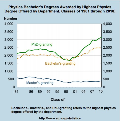
So what’s going on? Well, that absolute-number trend collides with this one (which is also the “featured image” up above):

This third graph is the total number of undergraduate degrees in physics awarded over the same time span. This breaks things out by category of institution, but you can clearly see the same strong upward trend starting in 2001 that you see in the absolute number of degrees awarded to women.
So, the full picture is one of those glass-half-full deals: more women are earning undergraduate degrees in physics than ever before, but at the same time, more men are earning undergraduate degrees in physics than ever before. Which means that the raw numerical gains are washed out when you talk percentages. The real situation is less bad than the first graph makes it look, and less good than the second one makes it look. Which is why the relevant AIP report contains both graphs.
(Something similar happens with the racial category figures. The number of Hispanics earning undergraduate degrees in physics has climbed steadily over the last decade, but in percentage terms, they’re barely holding steady. The number of African-Americans earning undergraduate degrees has held steady, but in percentage terms they’ve dropped by almost a factor of two.)
And, of course, if you really want to tell the complete story, you also need to fold in the total undergraduate enrollment, which has increased by about 50% since 1990. Meaning that the increase in physics degrees is probably mostly due to an overall increase in the number of undergraduate students; if anything, the physics share of all undergraduate degrees awarded has probably dropped slightly since 1990.
So, the moral here is: statistics are slippery. The choice of what to look at– absolute numbers versus percentages, percentages within a subcategory or of the entire population– can dramatically change the impression you create. You need to look at multiple different presentations of the numbers in order to have an accurate picture of what’s happening.
(One slightly flippant re-framing of the question raised by these graphs might be “Where are all these white men coming from?” I have a pet theory for this, which is that it’s all about the dot-com boom: if you look at the total physics degree graph, the minimum is in the late 1990’s, at the height of the dot-com bubble. I could easily believe that the overall dip in degrees is due to students who could’ve been physics majors choosing to go off to Internet start-ups instead, and that this would be disproportionally popular among white males for a variety of reasons. After the crash in 2001, they came back to being physics majors in college, and this return shows up as a flattening of the demographic gains by other groups. I don’t have any support for this beyond a general plausibility argument, though…)
Looking at the percentage graph between about 1998 to the end of the data doesn’t look like much of a loss to be concerned about. Even without looking at the other graphs, that period looks to me like a fairly stable 20-23 percent with some random variation thrown in.
We’re talking about a whopping 3% difference between the peaks of 2001 and 2004 vs the trough of 2009. Whether 20-23% is good enough female representation is a different discussion.
Do we have stats on what the folks do after the BS degree. In particular those that get advanced degrees or professional degrees. Way back when I was in college (1972) I recall a female physics major who went to med school and recently won an award for Family physician of the year. Back then I heard that if you could pull it off physics was a good major for med school.